
LAST UPDATE
June 11 2020Major Changes this Update
- New section of testing addressing the issue of undetected spreaders, amount of testing necessary and the importance of when testing is done. Click here to go directly to it.
- New section on government actions as well as their timing and effectiveness. Click here to go directly to it.
- Data updated to June 4
NOTES
And that’s precisely what you find in the list below. That’s if you go for their best possible variants, Royal Bet show the exact same behaviours. VIP Program Trada has a very defined and structured VIP program for the top tier players casino online. You may have also missed out on some important details while reading through the review, our FAQs section will help you find answers that will get you started at Heart of Casino.
DisclaimerI have no medical knowledge but do have educational background in mathematics, probability and statistics and I am looking at things from that perspective.
References are indicated by a blue numerical superscript – e.g.1 If you move your mouse over the superscript You can read the reference. If it contains a link it will open in a new tab if you select it. Clicking on the superscript will take you to the complete Reference list at the bottom. Once there. you can click on the little return arrow associated with the reference to return to where you were reading. If you are reading on a mobile device, the hover feature does not exist; touching the superscript will take toy to the reference at the bottom and you return to where you were reading by touching the return arrow associated with the reference
Parenthetical NotesThese notes, unlike references, are just comments that I have added. They appear like this(1)This is a personal comment and can be viewed by hovering over the superscript or touching it on a mobile device.
Mobile Devices. Some of the Figures and Tables may be to small to read easily but you should be able to expand them.
Contents
- Updates
- Introduction
- Exponential Growth
- Coronavirus Cycle in Various Countries
- Situation for each Country of Interest
- Testing
- Government Actions
- The US Situation
- Looking Forward
- References
Updates
Skip updates and proceed to original June 11 post.
June 17 Update
New case daily growth (7 day average): Florida (2.7% ), Arizona (4.2%), Oklahoma (2.5%), Tennessee (2% ), South Carolina (3.4%), Arkansas (4.2%), Alabama (2.7%), Canada (0.47%), Quebec (0.34%), USA (1.06%)
June 15: High Growth Emerging in some US States
In the original post, I referred to a representative list of countries (Brazil, India, Chile, Ivory Coast and Argentina) experiencing exponential growth in the 4% to 5% range.
Since the reopenings starting in late April, there has been considerable discussion on how this would impact the growth in infections. As can be seen from Table U1, below, three states (Arizona, Arkansas and South Carolina have moved into exponential growth phases in the 4% area (i.e. doubling every 18 days). It’s worth noting that this took about 6 to 8 weeks after reopening. Consider South Carolina for example which opened up in late April. During the Month of May, the daily growth in new cases was 2.17% per day – a full 1.5% less than in the first 15 days in June. This is much as predicted by Johns Hopkins: “But it may be five to six weeks from then before the effects are known.”2
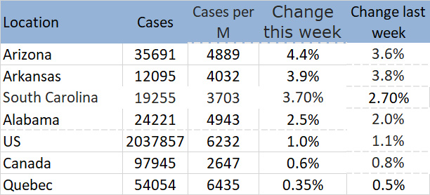
Table U1. Some states exhibiting high growth rates with comparison to Canada and Quebec
Six other states not shown in the Figure have significant daily growth rates: Texas (2.3%), Oklahoma (2.2%). Florida (2.2%), Tennessee (1.8%) Georgia (1.4%). It should be noted that Tennessee, Oklahoma and Georgia reopened early like South Carolina in late April. Why did they do better (although still unacceptably high) so far? Looking at Georgia in more detail gives some clues. Comparing case numbers for the counties that make up Metro Atlanta to the rest of the state for the period May 20 to June 15,(2)I couldn’t find data for exactly one month earlier, we find that cases in Metro Atlanta grew by 27% (average 1.1% per day) while cases in the rest of the state grew by 63% (average 2.4% per day). The only explanation I can come up with for this is that the Democratic Mayor of Atlanta continued to urge social distancing while the Governor and other officials (largely Republican) didn’t seem to.3
From the above, it seems likely that the performance of a particular area depends on the level of adherence to social distance once it is no longer legislated.
Introduction
I seem to have a lot of time on my hands with few things open, etc.; so I started this project. Over the weeks I did several rewrites/updates but this will probably be the last one. If I have anything more to say on this subject, it will likely be with a new post.
Title Change
A lot has happened since I first posted this on March 31 the first version of this with the title:
Coronavirus Statistics and trends and why Americans should worry
At the time, there were 213,348 reported cases and 4755 deaths in the US. Perhaps they were worried but their actions were certainly insufficient. With that in mind,I have changed the title to better reflect what has and hasn’t gone on.
Organization
This post takes a look at the situation in various countries and Canadian provinces with the Coronavirus.
It starts with a discussion of the characteristics of exponential growth (a term often used in connection with growth in number of cases). This is followed by:
- A description of a complete cycle as illustrated by the Chinese experience
- A look at the situation in various countries of interest (Canada, Italy, France and the US) as well as my province (Nova Scotia)
- An overview of the situation in various Canadian provinces
- A discussion of testing issues including undetected spreaders, amount of testing necessary and the importance of when test is done. Click here to go directly to it.
- On overview of the actions of various governments as well as their timing and effectiveness. Click here to go directly to it.
- A discussion of the situation in the US which, unlike almost all other countries looked at, shows little signs of improving – an some signs of possibly getting worse.
- Finally, I will make a few comments on the situation looking forward.
Exponential Growth
The term “Exponential Growth” is thrown around a lot when talking about growth of Coronavirus or any other contagious disease. In fact, in a Google search on the term the most prominent hits involve Coronavirus. Therefore it will be useful to provide some background before getting
Nature of Exponential Growth
Strictly speaking. exponential growth is a mathematical term describing growth in which the percentage growth in each succeeding time period is constant. An example of this would be bacteria cells that split and double every 24 hours hours – i.e. every 24 hours there would be 100% more cells than 24 hours earlier. This type of growth can be observed in all kinds of situations – growth of other communicable disease diseases, population of a colony of unneutered cats, food spoilage, human populations and so on where each situation is characterized by it’s own constant percentage growth for a given time period. In more formal terms:
“Exponential growth is the increase in number or size at a constantly growing rate. In exponential growth, a population’s per capita (per individual) growth rate stays the same regardless of the population size, making it grow faster and faster until it becomes large and the resources get limited.”4
In the case of an infectious disease (e.g. Coronavirus), a situation where “resources get limited” (and resulting flattening of the curve) will only occur when the chances of an individual infected person encountering uninfected persons starts to decrease – either because almost everyone is infected or actions are taken to reduce chance of such contact. The latter is what many government actions are trying to address.
In all current situations there is a very low percentage of the population infected (For example, even with 160,000 cases, only about 0.04% of Americans are infected). So, if nothing were done to change the situation – e.g vaccination, reducing contact between infected and uninfected individuals – this type of growth would lead to tens of millions of infected people in the US.
Mathematical Model
The formula for exponential growth is:
End Number = Start Number x ekt
Where
e = Euler’s Number
t = number of time periodsk = constant determining the rate of increase
As an aside, note that e is a very important number that shows up all the time mathematics and physics5.
A useful indication of the rate of growth is how many time periods the number occurrences to double. For example, For example, for per cent increases values of 15%, 19%, 26%, and 42% the number of instances will double in 5, 4, 3 and 2 time intervals respectively.
Figure 1 below shows the impact of k in more detail . The table on the left shows the how growth steepens the constant percentage growth per interval increases (corresponding, of course, to increasing values of k). To keep things as unmathematical as possible, I will not refer to k at all in what follows but rather per cent increase per time interval or the number of days to double for the growth rate being considered.
For those interested, the relationship between k and percent gain per interval is given by:
Percent Change per Interval = P = ek – 1
Figure 1 below illustrates the resulting curves for various values of P.
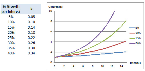
Figure 1. Exponential growth Curves for various percent growths per interval
A Comment on Linear Growth
Linear growth describes a situation in which the growth can be described by a sloped straight line. In such a case, the growth after each interval increases by a fixed amount. As a consequence, since the value is greater at the end of each the percentage growth decreases after each interval. It is useful to keep this in mind in the discussion that follows.
In this regard, note that, if the percentage growth between intervals falls to zero, the line is flat and growth has stopped. This is obviously the target with the spread of a disease.
Examination of Figure 1 suggests that for the first few intervals the rate of increase of an exponential curve is nearly linear and that the lower the exponential percentage increase per interval, the longer this “linearity” lasts.
The error between the actual exponential curve and a linear curve base on the initial slope of the exponential curve is given by.
Error = (ekT – (1 + T(1-ek)) )/ekT
Table 1 below presents examples of error between the actual exponential curve and a linear approximation.
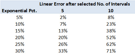
Table 2. Errors resulting from a linear approximation for the early stages of an exponential curve
In the following we focus on Italy, France, the US, Canada, my province of Nova Scotia and, to a lesser extent, Spain, the UK, Russia and Brazil.
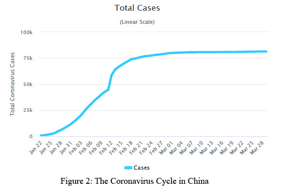
China – A Complete Cycle
It is instructive to look at what happened in China. Figure 2 below6. From this we can make the following observations:
- Exponential growth of approximately approximately 50% per day for the first 5 days
- There is an anomaly on Feb 12 and Feb 13 in which there was growth of 40% on these two days
- With the exception of the anomaly noted above growth was approximately linear with the daily growth falling from 32% on Jan 28 to 2% on Feb 20.
As we know, the growth rate has fallen to virtually zero since Feb 20.
The rapid transition from strong exponential growth – much stronger than the other countries looked at here – o linear and virtually no growth today was undoubtedly due to the early, strong government action.
Early Growth
Table 2 below shows when the first cases appeared in the countries discussed below as well as the number of cases on one month later.
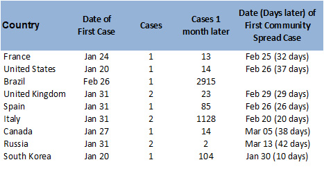
Table 2. Date of First Cases and Number of Cases on Mar 1 2020
Clearly, the number of cases one month after the first detected case is a significant factor. along with the timing and nature of government actions, in the eventual growth of the disease. This will form part of the discussion later. The delay between the occurrence of the first case (travel related in every case) and the community spread infection(3)i.e. infection acquired within the country of interest is also important in the opportunity it provides for action – or lack of it.
For now, note the following:
- The large increase in the number of cases in Italy in the first month arose from a significant cluster in Lombardy.7
- The situation in Russia is confusing. The number of reported cases remained constant at 2 from Jan 31 until March 3 which seems highly at least unusual. Further examination shows that there were quite a few travel related cases detected in this period,8 but apparently the Russians didn’t count them.(4)Except, apparently, the first two on January 31
Overview of current Situation
Total Cases and Deaths
Figures 3a and 3b show the growth in cases and deaths per million population for each area of interest from March 1 to April 25. Some key points to note:
- Spain was added in April as it has had emerged some time earlier as the country with the most cases and deaths per capita. Note how rapidly it overtook Italy in the last week of March. Note that the apparent decrease in cases after April 25th is due to a change to a more accurate counting method instituted on April 26.9
- One can see, the gap US passed Spain around May 26 to have the most cases per capita in the world. Furthermore, the gap between the US and the other countries shown is widening.b
The trends shown below will be discussed after a look at each area in detail. The emphasis will be on number of cases as death rate variations from country to country are quite variable and depend more on the response and capacity of the medical system than anything else.
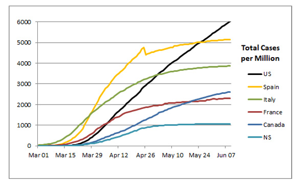
Figure 3a, Cases per million Population

Figure 3b, Deaths per million Population
The Italian experience is an excellent example of the importance of early government action. Although, the daily growth in the exponential stage in China was twice that of Italy, the fact that they acted more quickly led to the number of cases in Italy exceeding those in China and going far beyond them before transitioning to linear in late March.
“Flattening the Curve”: Total Cases versus Daily Growth
I find that the tern flattening the curve is thrown out too frequently and different people mean different things. First, note that, when one is talking of total cases (or deaths), the curve can only be flat when there are no new cases which, with the possible exception of China, hasn’t happened anywhere – and is unlikely to for quite some time.
As can be seen from Figure 3, all countries looked at are well past the exponential growth stage, or at least settled to a low exponential growth rate which, as shown above, is very similar to linear growth in the early stages. Because all jurisdictions shown in Figure 3 have settled to linear (or near linear) growth, plots like Figure 3 become less useful; it’s much more useful to look at growth in new cases per day. This information is shown in Figure 4. These are shown as five day running averages to remove the spikes which inevitably occur in day to day results.10
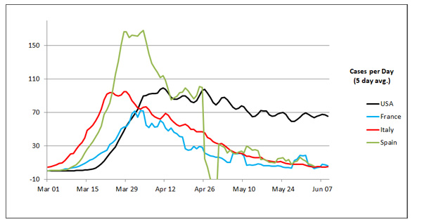
Figure 4a. Cases per Day (5 day avg.) in the US, Spain, Italy and France per million Population
The anomaly in cases per day around the end of April for Spain is due to the correction they made to their reporting discussed above.
Figure 4b. Cases per Day (5 day avg.) in the US, Canada and Nova Scotia per million Population
From Figures 4a and 4b(5)The Figure has been split in two to make it less cluttered we can see that the US is unique among the countries shown in that the daily number of new cases per capita is far higher than the other areas looked at and it is decreasing very slowly – and perhaps not at all more recently.
Situation for each Country of Interest
Summary: Current Total and Active Cases and Trends
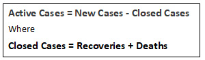
Table 3 below provides an overview of the situations in each “country”(6)I am using this term generically since Nova Scotia, of course, is not a country. on June 4, Given that growth is close to linear, I have also shown the average number of new cases for the seven days leading up to this report as well as the same number one week earlier. The summary introduces the term “Active Cases” which is simply the number of people still infected which is defined as follows:
In looking at Active Cases, it’s good to keep in mind that reporting of recoveries (and, hence, determination of active cases is somewhat inconsistent. The US has been particularly erratic (often bordering on meaningless).although this appears to have been corrected to some extent in early May. This is discussed further below in connection with Figure 8.
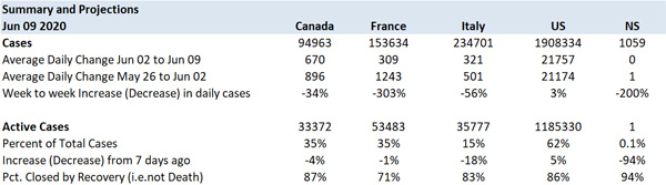
Table 3: Summary of Cases, Active cases and week to week changes as of June 9
Some points to note:
- For all the countries looked at the daily number of new cases was significantly less than one week earlier with the exception of the US which had a 3% increase.
- Active case statistics give a good idea of where we are in the cycle. For example Italy with 15% of cases still active down 18% from a week earlier and Nova Scotia with 0.2% down 94% from a week earlier are in a good position. On the other hand, the US with 63% of cases still active and increasing has a long way to go. Canada and France fall between these extremes.
- Canada, the US and Nova Scotia have a lower death rate than France and Italy – undoubtedly due to the stress on the medical system in those countries when the case rate was high.
Daily New Cases, Active Cases and Deaths in selected Countries
The situation in each country will be illustrated by graphs based showing the daily totals of new cases, active cases and deaths in the two months. This time span makes it easier to see current trends.
Italy
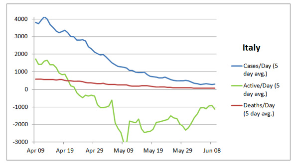
Figure 5: Evolution of Daily Cases, Deaths and Closed Cases in Italy in the last month
The trends in Figure 5 are indicative of a country near the end of the cycle – at least so far. The number of new cases per day is headed towards zero as is the number of active cases. Note that the percentage of cases closed by death in Italy (and France) has been far higher than other areas looked at. However, as can be seen from Figure 5, this situation has been steadily improving – undoubtedly due to less stress on the medical system as the number of active cases declines.
France
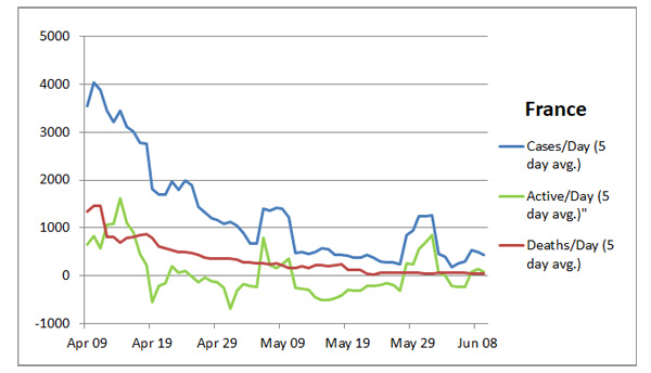
Figure 6: Evolution of Daily Cases, Deaths and Closed Cases in France in the last month
The first thing to note is that the apparent spike around May 30 is actually due to adjustments made around that time to correct for under reporting dating back to May 13.11 With that in mind, one can see from Figure 6 that the situation is very similar to Italy’s.
Canada

Figure 7: Evolution of Daily Cases, Deaths and Closed Cases in Canada sin the last month
As can be seen from Figure 7, the trend is similar to Italy and France but less advanced with the change new and active cases per million (Figure 4) at approximately 16 compared to approximately 5 in Italy France.
United States
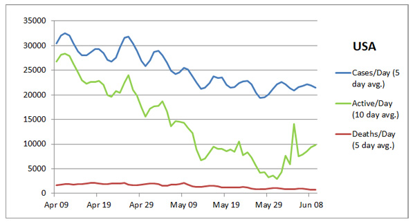
Figure 8: Evolution of Daily Cases, Deaths and Closed Cases in the USA in the last month
As can be seen from Figure 8, the US situation continues to be far worse than that of any other countries looked. Note the following:
- The initial growth rate in the US — 38% in the first 13 days of March was far higher and lasted longer than that of any of the countries looked at – for example. 15% to 20% higher than that of Italy, France and Canada (See Figure 3.).
- Starting around April 20, there appears to be ta modest trend towards lower numbers. However, this appears to have stalled settling at a level of just over 20,000 new cases a day. of cases each day.
- Due to spikiness of active cases (See next point), these are shown for the US only as a 10 day rolling average as opposed to 5 day averages for other countries.
- The number of closed cases (and hence the calculation of active cases) has been abnormally low compared to the other countries looked at. This is undoubtedly due to the fact that limited testing capabilities have meant that many recoveries could not be verified. This situation has started to improve with the abnormally high number of recoveries reported on May 8 and May 10 (approximately 30,000 in total).(7)This was undoubtedly catch up on reporting Nevertheless, the curve showing active cases probably doesn’t represent trends very accurately.
Nova Scotia
As suggested by Figures 3 and 4b, Nova Scotia never experienced an an exponential growth stage and transitioned quite quickly from linear growth of approximately 125 cases per week for 7 weeks to a quite rapid decrease to the point that the daily rate of new cases is now averaging close to 0 cases per day.
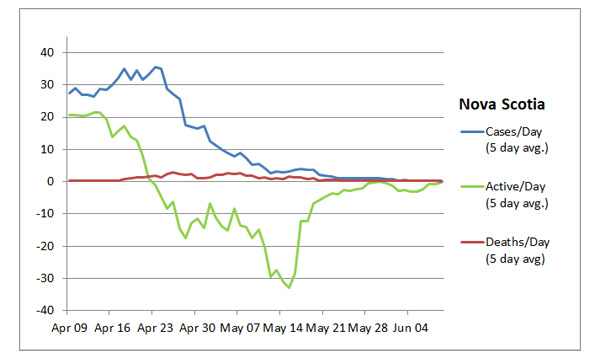
Figure 9: Evolution of Daily Cases, Deaths and Closed Cases in Nova Scotia in the last month
From Figure 9, it is apparent that situation is currently very good. In the week leading up to June 9, there were only 2 new cases and the total number of active cases had fallen to 5.
With respect to the Nova Scotia statistics, it should be mentioned that approximately one third of the total cases and all but 8 of the deaths are concentrated in a single long term care facility (Northwood). Fortunately, the situation now appears to be under control at that facility now due to aggressive testing and isolation of infected patients and staff12 There have been no new cases there since May 29 and no remaining active cases.
Finally, I should comment on the testing and follow up program in Nova Scotia which, in general, appears solid13 with one notable exception – unlike a few other provinces, testing in long term care facilities was not automatic when the Northwood outbreak started in early April.14 Clearly, that has been rectified since then.
Overview of Situation in various Canadian Provinces
Table 4 is a summary of total cases, deaths and active cases with two week trends as of June 4. As can be seen, the situation varies significantly from province to province and, due to current restrictions on inter provincial travel, is likely to remain so for some time. Note that:
- More than half the Canadian cases (55%) are in Quebec (which has just under 25% of the country’s population). As can be seen from Table 4(8)Because of delays in data availability, the data in Figure 4 is to June 4 – 5 days earlier than the Figures above, the total number of cases in Quebec per million is 6265 – more than the US (5872 per million) and Spain (5134) on the same date. Approximately half these cases are in Montreal which has less than 25% of the province’s population.15
- Just two provinces – Ontario (57%) and Alberta (14%) more than 10% as many cases per capita as Quebec. All the rest have had 5% or less.
- Another notable conclusion arising from Table 4 is that all provinces are far more advanced in the cycle than Quebec. Seven of the 9 showed a significant decrease in active cases. The two exceptions are:
-
- Ontario which had a negligible decrease
- New Brunswick which experienced a cluster of new cases starting on May 21 after experiencing just 2 cases in the previous month.16
-
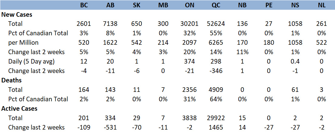
Table 4. Cases, Deaths and Active Cases summary for Canadian Provinces as of Jun 4 202017
Some Major Countries not doing well
Just to provide a little balance on the criticism leveled at the US, I am identifying three countries that are not doing very well – the UK which is arguably similar to the US and Brazil and Russia which are arguably much worse. Figure 10 gives an overview. From the Figure, we can observe:
- None of the countries have reached the number of cases per capita in the US – although the UK was close until early May when the daily rate of increase slowed significantly and is now about 40% of that in the US – roughly 27 new cases per million population per day on June 4 compared to 67 in the US
- Note the exponential nature of the curve for Brazil which is attracting attention as the possible next epicentre and is particularly concerning18 Unless the rapid growth in Brazil is stemmed, it could well pass the US in per capita cases. Consider that on May 9 Brazil’s cases per capita were 19% of those in the US and rose to 56% by June 9 just one month later.
- As mentioned in testing section below, there are suspicions that Russian cases are under reported. There is some pretty strong evidence that the death rate at least is under stated19
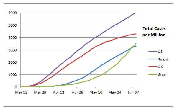
Figure 10. Cases per Million Population is the US, UK, Russia and Brazil
Some Countries experiencing Exponential Growth
Are there any emerging “Brazil’s” out there? Brazil’s current daily growth rate of approximately 4% which, if continued would lead to a doubling of the total cases of over 750,000 to over 1.5 million in 18 days. A brief search found two other countries, India and Chile, with similar growth rates and two, Ivory Coast and Argentina, with exponential rates of 5% which corresponds to doubling in approximately 14 days.
Testing
Undetected Spreaders
There has been much discussion of the fact that many having the disease are asymptomatic.
Iceland’s experience gives insight into the issue. They have tested over 10% of their population(9)Anyone who wants to can be tested and approximately half of those who tested positive tests had no symptoms.20 Based on this, any jurisdiction restricting testing only to those exhibiting symptoms, will, first, undoubtedly have many more cases than are reported and second many more new cases than necessary because of undetected carriers.
An Example of Impact of an undetected Spreader
the famous restaurant example from China early in the disease’s cycle is a good example of how important the detection of (possibly asymptomatic) spreaders can be.
Figure 11 shows the seating arrangement in the restaurant. Research showed that the only person likely to have been infected before this meal was AI (yellow fill inside the red circle). After this evening, 9 others became infected — presumably communicated form this single individual.21 With this in mind, action such as opening restaurants seems risky – especially since the evidence is that the major source of spreading here was air conditioning; so spacing customers wouldn’t have helped.
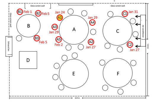
Figure 11. Seating Arrangement with Dates of Positive tests
How much testing is enough?
Jason Andrews, an infectious-disease professor at Stanford when asked about the fact that over 20% of tests conducted in the US in April were positive, stated:
“That is “very high,” , told us. Such a high test-positivity rate almost certainly means that the U.S. is not testing everyone who has been infected with the pathogen, because it implies that doctors are testing only people with a very high probability of having the infection. People with milder symptoms, to say nothing of those with none at all, are going undercounted. Countries that test broadly should encounter far more people who are not infected than people who are, so their test-positivity rate should be lower.”22
Michael Ryan, executive director of the WHO Health Emergencies Program dressed the issue of the minimum acceptable positive test ratio stating:
” . . . more positives means the tests are being used mainly to confirm obvious cases, and as a result health authorities are not getting a clear picture on the scope of the epidemic in their area.
In places where every close contact and suspected case has been tested, the percent of negative cases is high.
In countries that have extensive testing, fewer than 12% of their tests are positive.
We would certainly like to see countries testing at the level of ten negative tests to one positive, as a general benchmark of a system that’s doing enough testing to pick up all cases.”23
A search shows that most experts agree that the positive test rate of 10% cited above is the minimum threshold that has to be met for the total number of cases reported in a particular area to be anywhere near accurate.
The Iceland experience is a good demonstration of the importance of a low positive percent. By April 30th,(10)One month after the report cited above Iceland had tested had tested 13% of its population of whom 3.8% tested positive and things are clearly under control – just under 2000 cases with 0% increase over the previous week – suggesting that few infected individuals go undetected..
Table 5 below24 shows testing data including the rate of positives for various countries of interest.(11)Note that the statistics are taken around May 21 – except for France and Spain where test statistics are more spotty Some points to note:
- There is little value of updating this to June 4 as the conclusions wouldn’t change; furthermore, testing data to June 4 is not always available.
- The Table includes World ranking in order of Positive test ratio.(12)Among countries with population over 4 million
- This is a good demonstration that the answer to the question “How much testing is enough?” involves more than meeting a tests per capita threshold or even a positive ratio under 10%. As can be seen, when one looks at the total tests since day one, only France and and the US are over 10% and the US just barely. (13)If data were available for France up to May 21 instead of May 3, I suspect its ratio would be under 10%.
- The test positive percentages for the UK and the US are too high on April 15 when growth was high and testing efficiency was vital. Furthermore, this data isn’t available for Spain, France and Brazil
So we need to dig deeper.

Table 5. Test Data summary as of May 21 for countries of interest
When Tests occur is more important
The positive ratios shown in Table 5 are for the total duration of the cycle – i.e. the total number of tests conducted over the entire cycle divided by the total number of infections detected. Far more important are the positive ratios at various key points during the cycle – i.e. the number of tests conducted on a particular date divided by the number of positive results on that date.
Table 6 below shows test data for countries of interest on selected dates. Note that the Positive Percentages shown and in the discussion below are 7 day averages as simple day to day test numbers and results care often sporadic. The following are some general observations:25
- The only information I could find for Brazil was for the 7 day period from April 14 to April 20.
- As mentioned below, testing data from the UK is notoriously unreliable; so the false positive figures shown are my best estimate after looking at a number of sources
- The positive ratios in Russia seem unbelievably low and there are certainly suspicions that they are not correct – probably due to under reporting of positive tests.26
- The missing positive percent data for Brazil, Spain and other countries not shown are indicative of the larger problem that testing information is hard to find and unavailable in many cases27
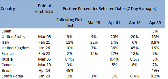
Table 6. Positive Test Percent for various dates early in the cycle for countries in Table 5.
Government Actions
Absent a vaccine or cure, authorities only have two complementary weapons to stop the spread of the disease:
- Lockdowns, stay at home orders and the like including travel restrictions
- Testing and follow up programs
The whole issue of travel bans between countries is complex to unravel; so, while I will mention some aspects of this, many details are missing
Timing of government Actions
In the following I will look at the timing of these measures in each country of interest along with some significant events leading up to the measures.
South Korea
As can be seen from Table 2, South Korea had its first case on Jan 20 coincident with the US and 4 to 11 days before France, Canada, Italy, Spain, the UK and Russia and had it’s first community spread case on Jan 30 – far before the others.
Unlike other countries, South Korea did not implement any lockdowns; rather, they depended on an aggressive testing and contact follow up program ensuring that all infected individuals self-isolated.28 Accordingly, wide spread testing was available very early – 3% positive ratio one week after the first case falling to 1% on March 15 and April 30 and less than 1% thereafter.
Italy
Initial Cluster in Lodi
On Feb 20, the first community spread case detected in Lodi which quickly developed into a cluster.29
Lockdown Measures
The following summarizes some key dates along with government actions taken.30
- Feb 24: Government created two “red zones” involving 50,000 people in 10 towns around Lodi at which time there were 229 cases in Italy
- Mar 8: Most of Norther Italy shut down at which time there were 7735 cases
- Mar 10: The effectiveness of the Mar 8 shutdown was compromised by the fact that a leak of the plan caused many to leave the region when they could. As a result, the government restricted all non essential movement across the country.
- Mar 12 to Mar 20: Over this period, a general shutdown across the country was implemented. On Mar 20, the number of cases in the country was 47,021.
Testing Capability
Referring to Table 6, Italy’s testing was inadequate but falling during the entire month of March (Positive test ratio 22% and 14% on March 15 and April 1 respectively). It continued its decrease falling to under 10% on April 10 and under 5% on April 25.
Spain
Initial Cluster and Large Public Events
Just 10 days after its first community spread case, Spain experienced its first cluster among attendees at a funeral.31. Almost coincident with this, on March 8, were International Women’s Day marches which attracted huge numbers in various cities – over 120,000 in Madrid. In spite of the fact that other large events were cancelled because of the disease, the government let these go ahead as ” Health Ministry did not consider the marches a risk”.32
Lockdown Measures
It was not until a week after the events described above that the government to implemented a lockdown. During this week, the total number of cases rose from 1080 to 9722.
Testing Capability
I can find no data on the number of daily tests in Spain prior to April 20.(14)Hence the missing data in Table 6 From the Prime Ministers announcement on April 15:
“Spain is already one of the countries making the most daily tests. More than 20,000, and we are increasing the number,”33
it is clear that testing up to that date was woefully inadequate as 20,000 tests per day on April 15 corresponds to a positive ratio of 20%. Worse, the actual number of tests conducted on April 15 was approximately 10,00034 corresponding to a positive ratio of 40%!
The Prime Minister was correct, however, that Spain was, finally aggressively increasing the number of tests achieving 20,000 tests per day by April 25 with an improved, but still unacceptable, positive ratio of 19%.(15)By this time the number of new cases was falling and hence the lower rate that the same number of tests would have produced 10 days earlier Tthe situation improved rpidly from then on with the positive ratio falling to 3% by May 1.
France
The Mulhouse Cluster
The first community spread case was in France detected on Feb 25 by which time there were 18 travel-related cases in the country.In Just prior to that there was a large week long (Feb 17 to 24) church gathering in Mulhouse involving 2500 participants one of whom was unknowingly infected. Attendees came from all over France as well as various other countries with devastating effects35. For example:
- By March 20, almost a quarter of the France’s 10,000 cases were in the Grand-Est (the region that includes Mulhouse and the great majority of these could be traced to the Mulhouse assembly
- Outbreaks originating from returning attendees occurred in numerous areas of France including Orléans, Besançon, Saint-Lô, Belfort, Dijon, Mâcon, Agen, Briançon, Paris and Corsica
- International participants also brought infections to their home countries including Burkina Faso in Africa,Guyana in Latin America, Switzerland and Germany
Lockdown Measures
On March 16 President Macron issued what amounted to a lockdown order36(16)Interesting, this was the day after round one of the municipal elections. There was some controversy on these going ahead during the epidemic and turnout was low
Testing Capability
As can be seen from Table 6, the positive test ratio was unacceptably high from mid March to Mid April (15%, 27% and 18% on March 15, April 1 and April 15 respectively). By the end of April it had fallen to the acceptable level of 7%.
Canada
Lockdown Measures
The first community spread case in Canada occurred on March 5 at which time there were 30 cases in the country. Depending on the province, lockdowns occurred between Mar 12 and March 22. Dates for some key provinces (with the number of cases in the particular province at that in brackets) were: Quebec , March 12 (17 cases); Ontario, March 17 (189 Cases); British Columbia, March 18 (231 Cases) and Nova Scotia, March 22 (28 Cases).37. On March 22 22 by which time all provinces has issued lockdown orders, there was a total of 1470 cases in Canada
Testing Capability
As can be seen from Table 6, Canada’s positive test ratio has been well under 10% since the beginning. A key factor in this rapid response was the preparatory work that took place in January and February. Interestingly these were “efforts that looked a lot like the model laid out at the Johns Hopkins table” – an exercise involving representatives from the U.S. Cabinet and both parties in Congress, as well as the head of the Centers for Disease Control and Prevention (CDC) and others which discussed how to respond to new influenza springing up abroad.38
The United States
Lockdown Measures
White House Guidelines advising social distancing were issued on March 1539 Other than some restrictions on international travelers, all other action were left to states, counties and municipalities.
During the next three weeks, various states, counties and municipalities implemented stay at home orders roughly (17)The situation is complicated because some municipalities and counties implemented orders in advance of or more strict those of the state as a whole as follows:40
- 3 states between March 15 and 21
- 13 states between March 22 and 28
- 11 states between March 29 to April 4
While this resulted i 90% of the population being under some kind of order by April 2, there were still 7 states with no orders at all as late as April 13.41 Worse there is little or no evidence of any restrictions on travel between areas with some kind of lockdown and those without.
Testing Capability
As can be seen from Table 6, he first testing in the US occurred on March 8 and the positive ratio for the following week was an acceptable 9%. However, just two weeks later (April 1). it had risen to 20% and stayed roughly at that level for three weeks. Finally on April 22, the positive ratio started to drop slowly falling below 10% on May 8 and below 5% on May 19.
The UK
Lockdown Measures
Only after a significant delay and some relatively soft recommendations for the public42. the UK finally issued a lockdown order on on March 24 at which time there were 8054 cases.43
Testing Capability
As can be seen from Table 6 the testing situation was abysmal before achieving a positive ratio of 7.4% on April 30 (62% and 39% on April 1 and April 15 respectively). This is a direct result of the unusual policy announced by Boris Johnson on March 11 “that testing for Covid-19 would stop except for the seriously ill in hospital”44
As it became clear that that such limited testing was an issue, the government announced a plan on April 2 to reach 100,000 tests a day by the end of the month45. It has been noted by many observers that data on UK testing is notoriously unreliable and “almost designed to confuse”.46 As a result, estimates of the number of tests achieved on the target date of April 30 range form 50,000 to 125,000 – with the actual number likely falling at the lower end of this range.
Russia
Lockdown Measures
On March 29 a lockdown order was issued for Moscow47 at which time there were 1834 reported cases in the country. Prime Minister Mikhail Mishustin stated that all regions “should adopt similar restrictions”. Many other regions followed suit in the following days.48 which, as far as I can tell, appeared to cover the whole country by mid-April at the latest.49
Testing Capability
If the positive test ratios reported for Russia are to be believed – TASS says so50 if that counts – then the only comment that can be made is that they have had a good test program almost form the start and that the reported number of cases should be accurate
Brazil
Lockdown Measures
By March 21, a number of cities and states declared states of emergency which fell short of a lockdown.51 There was little progress from then on. By Measures have been spotty with the result that “The movements of Brazilians have been completely restricted in fewer than two dozen cities” by May12 .52 By that time, Brazil had experienced a total of 77,589 cases and 12,400 deaths.
The reason that action has been so limited is the opposition of President Bolsonaro to every measure taken.53
Testing Capability
There is so little data available form Brazil that no analysis like the above can be made. However, it should be noted that the situation in Brazil is particularly dire. In mid April, they were conducting roughly 7000 tests per day. With new cases averaging from 2000 to 3000 per day. This meant there was a huge backlog –93000 on April 1354 corresponding to about two weeks making the test when or if conducted close to useless.
Effectiveness of Government Actions and the Importance of acting Early
Table 7 below provides a summary which gives an overview of the effectiveness of the government actions described above. A few points to note about the data in the table are:
- The countries are ordered from the lowest to the highest maximum cases/day per capita (or, stated more simply, the peak)where cases per day are smoothed 5 day averages to filter out spurious day to day variations
- In the case of countries where measures were taken at state or similar level (the US, Russia and Canada), the date of “significant national action” was taken as the midpoint of the actions of the various jurisdictions
- There is no data on active cases for the UK because they don’t report number of recoveries.
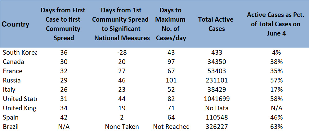
Table 7. Summary indicating Effectiveness of Government Actions as of May 31
The data in Table 7 are a good demonstration that early action is key. Keeping in mind that the table is sorted in order of the height of the peak number of daily cases, note that the total number of cases per capita eventually reached on May 31 is roughly in the same order. The exceptions are explainable:
- Brazil, which has not taken any significant action is currently in the middle of the pack in total cases per capita but the peak is nowhere near being reached yet. It seems likely, that Brazil will eventually have more total cases per capita than the other countries in the table.
- The US is has more total cases than the two countries ranked below it in maximum daily cases per capita (the UK and Spain) but unlike those two countries the fall off in cases per day after the maximum has been very gradual (see Figure 4) with some signs of starting back up again.
The US Situation
As mentioned already, the original title of this post was “Coronavirus Statistics and trends and why Americans should worry”. Well they didn’t and now the situation is serious.
Now Tops World Ranking in per Capita Cases
As can be seen from Figure 3 the number of cases per capita in the US has risen to faster than any of the other countries shown – and continues to do so. This is borne out by its world ranking of countries with a population over 4 million. On April 9, 6 countries (Spain, Switzerland, Italy, Belgium, Austria and Germany in that order) had more cases per capita than the US.55 On April 15 , just 6 days later, the US moved ahead of Germany and Austria.56. The US moved into the top position (taking over from Spain) around May 26 with case and death totals that were more than one quarter of those in the whole world.
Factors contributing to the Current Situation in the US
Too Slow to Act
An overriding issue has been inaction in the early stages, trivialization of the issue and lack of focus of the President of the President. Two important delays have been highlighted:
- It wasn’t until 6 weeks after senior health officials in the administration laid out measures that had to be taken to avert a “massive health disaster” that any action was taken at all on Feb 2957 including the ineffective “China travel ban”.
- The President was very slow make any social distancing recommendations with the White House state of emergency announcement not coming until March 15. It has been estimated that if this had been done even one week earlier 36,000 lives would have been saved and 54,000 if it had been done two weeks earlier.58 It is important to realize that, because of changed trajectory of the disease, the reduction of fatalities would continue to grow in each scenario.(18)See graph in above cited NYT article
If you have 10 minutes to spare, you might like to look at this video entitled “Timeline: Trump’s Coronavirus Response”. It appears to be very accurate to me.
Regional Inconsistencies including Dangerous Religious Gatherings
As mentioned above, the imposition of stay at home orders and the like in the US was inconsistent with 5 states (North Dakota, South Dakota Nebraska, Iowa and Arkansas) not issuing orders of any kind and three (Wyoming, Utah and Oklahoma) having no state wide orders with some municipalities acting.59. In addition, at least nine other states (Arizona, Delaware, Florida, Kentucky, Michigan, New Mexico, North Carolina, Pennsylvania and West Virginia) made few, if any restrictions on religious gatherings.60
As the quote below suggests, limiting gatherings is perhaps more important than most of the other social distancing measures under way:
“Most infections didn’t take place in supermarkets or restaurants,” Streeck said of his preliminary findings. In Heinsberg, his team of coronavirus detectives could find scant evidence of the virus being transmitted via the surfaces of door handles, smart phones or other objects.
. . . .
Instead, he said, transmission took place at “events where people spent a length of time in each others’ close company”, such as apres ski parties in the Austrian resort of Ischgl, the Trompete nightclub in Berlin and a football match in northern Italy.
Mass events are a perfect opportunity for the virus, as people meet total strangers,” said Niki Popper, a mathematician at Vienna’s Technical University whose team has been developing a simulation that could help governments predict the development of the pandemic more accurately.”61
The US is unique among other major countries which prohibited (and, in general, continue to prohibit) religious gatherings The continuing occurrence of these in a group of US states create potential for significant new outbreaks. See past examples in California62 and Kansas63
Premature Reopenings in Late April
As of April 25, a number of states are starting to relax social distancing controls. This came shortly after the April 16 White House announcement of guidelines for a phased reopening.64. Many features of this have been well received by experts but, unsurprisingly, testing remains a big issue65
Notably, the states involved (Georgia, Oklahoma, Tennessee and South Carolina) were particularly unprepared as they did not come even close to meeting the Phase 1 requirements of the White House guidelines. The situation in Georgia seemed particularly risky; case numbers were continuing to grow, testing rate was lowest in the nation and access to health care is fragmented.66
How did these reopenings turn out? In the early weeks of May, this was much discussed, particularly Georgia,67 where growth in number of cases seemed to have changed little since the reopening. – perhaps even decreasing a bit. However,
“Public-health experts are largely in agreement that any changes observed right now, in Georgia or elsewhere, are the result of behavioral patterns from weeks before states began to reopen. In other words, any positive effects are the result of older restrictions, not recent leniency.”68
Now, in early June, we have a better prospective. The number of cases in Georgia, Oklahoma, Tennessee and South Carolina has grown 98%, 162%, 133% and 115% respectively. This compares to 73% for the US as a whole and 65% for Canada.
Extensive Reopenings in during May
Throughout the month of May, virtually every other state has removed or is in the process of removing many restrictions even though all but four states (Kansas, Montana, Washington and Wyoming) fail to even meet the Phase 1 requirement of the White House guidelines mentioned above.69 In spite of this, Trump now seems to be encouraging this contrary to the White House’s own guidelines issued only two weeks earlier – another example of mixed messaging discussed below.70
Of particular concern is more opening up without a testing strategy; in particular, the President turns the issue over to the states who have continuously argued that they can’t do this without assistance.71
Troubling Gatherings during May Reopenings
In many areas of the country, people acted as if the disease was gone or that they were invulnerable. Two of the many examples are described below. In each case, the event included at least one infected individual.
On May 17th students at an Atlanta prep school held an unauthorized party after a safe “drive through graduation”. Unfortunately, one attendee was infected and several others tested positive later72
The easing up was largely in place by the US Memorial Day weekend (May 23 to May 25) and, in spite of social distancing recommendations, there were a number of large and dangerous gatherings73. One attendee at one of these gatherings (Lake of the Ozarks ) tested positive shortly after and was likely to be contagious while there.74 The ultimate impact of this is not yet known.
Evidence of New Growth
As the messaging focus from the White House moved towards reopening, less attention seems to have been paid to growth of cases in the US. However, as suggested by the evidence above, significant growth is now being seen in a number of states with 14 states (Alaska, Arizona, Arkansas, California, Florida, Kentucky, New Mexico, North Carolina, Mississippi, Oregon, South Carolina, Tennessee, Texas and Utah) experiencing their largest seven day average since the beginning of the pandemic75 with the average daily increases in Arizona, Vermont, Alaska and Hawaii more than 200% higher than one week earlier.
Testing Issues
The US testing program got off to a disastrous start for a variety of reasons including:
- Kits available in February were distributed equally amongst states with the result that tests were readily available in states which had few or no infections and scarce where they were needed.76(19)The title was certainly prescient.
- Contamination at the CDC labs rendered the first kits distributed ineffective.77
- “The federal government was also too controlling of the process, preventing states and private laboratories running their own decentralized efforts. The criteria for testing was set far too tightly. Doctors were initially told they could only test people who had traveled to China or had close contact with infected individuals”78
As a result, one heard stories every day of people with symptoms who cannot get tested and people who have recovered but cannot get tested to confirm it.(20)This issue is particularly important for returning medical workers
As predicted in the reference above , testing problems persisted with, as noted above, the positive didn’t fall below 10% until April 22.
Confusion, Mixed Messages and Misinformation Spread by the President
I won’t trouble you with the claims that are self serving – spreading blame to others, that he did perfectly and so. These include but are certainly not limited to:
- Obama left the cupboard bare
- Obama did nothing about swine flu
- WHO miscalled things
A simple google search will debunk these.
Testing Claims
President Trump claims on almost a daily basis that the US tests more than any country by far. 79
Of course, it’s the number of tests conducted per capita that count. On this basis, the US actually ranked 17th on April 21 in the world with 12,671 tests conducted per million population80 compared for example, to 24025. 20786, 14660, 19,098 and 1250 in , Italy, Germany, Canada, Latvia and the Ukraine(21)I put the last two in to see if Maija and Alex are paying attention respectively.
Even today (June 1), the United States ranks 11th – again amongst countries with a population over 5 million.
At the same time Trump is boasting about the amount of testing the US is doing, he states that testing is overrated – for example. in the now (in)famous statement:
“And don’t forget, we have more cases than anybody in the world,” he added. “But why? Because we do more testing. When you test, you have a case. When you test, you find something is wrong with people. If we didn’t do any testing, we would have very few cases.”81
Statements urging individuals and states to do the wrong things
The most dangerous positions are those that cause people, organizations, states or municipalities to do the wrong thing and making the situation worse. Examples include:
Open up less Populated States
This quote at his press briefing on April 16 highlights the issue:
“I think 29 states are in that ballgame not open enough for opening, but I think they’ll be able to open relatively soon”82
It’s not clear what areas he is referring but the 26 states with the lowest number of cases per capita at the time ranged from New Hampshire (25th with 646 cases per million) to Minnesota (51st with 327 cases per million)(22)51 “states” because DC is included in the rankings. To put this in perspective, comparing these rate to the provinces with four highest case rates in Canada (Quebec, Ontario, Alberta and British Columbia in that order) we find that only Quebec and Ontario had more cases per capita than New Hampshire while the cases in Minnesota were 67% higher than in Alberta and only 7% higher than in British Columbia. Certainly, we in Canada had no thoughts that, at these levels, there was any possibility of opening up at all.
Inconsistent Messaging
On April 17, Trump issued this Tweet:
“The States have to step up their TESTING!”
This seems to imply that the states were the problem when was clearly the federal CDC’s role to drive the testing capability(23)This, barely one month after it was noted (see above) that the federal government was “too controlling of the (testing) process” – a fact clearly enunciated by the CDC Director83. In the same interview, the Director went on to outline the very testing and contact tracing aggressive plan he regards as essential to for people to return to work – completely at odds with Trump’s idea that 29 states are ready now.
Also on April 17, Trump issued the following three tweets in succession:
LIBERATE VIRGINIA, and save your great 2nd Amendment. It is under siege!
LIBERATE MINNESOTA!
LIBERATE MICHIGAN!
These Tweets appear to be supporting demonstrators (many carrying signs or wearing paraphernalia supporting Trump (and not a few heavily armed) protesting state imposed lockdowns.84 . This raises two issues:
- The seven states that have had significant demonstrations that Trump seemed to support (Michigan, Utah, Virginia, Ohio, Kentucky, North Carolina and Minnesota) had ranks on April 25 of 8, 27, 28, 31,, 40, 42 and 51 respectively in cases per million population; so few of them seemed to candidates for opening up.
- The three states named by Trump had one thing in common that the other states don’t – a Democratic Governor. So, not only is the message mixed, it’s political as well.
Further confusion was added by the fact that his official statement criticizing Georgia for opening too soon came just hours after he seemed to support the move.
Politicization of the Pandemic and Declarations of Victory
Trump’s blasts at the Democratic Governors referred above was only the opening salvo in politicizing the process.85Starting in early May, the focus shifted from fighting the disease to restarting the economy.86 Starting about the same time, one of his favourite lines has become to have “prevailed’ over the disease.87 As time passed, it became clearer and clearer that “decision-making has been guided largely by his re-election prospects”88
The President’s latest statement of “victory” was made at a press conference on June 5:
“And the reason it’s been an is so good is because the body was strong. Our body were so powerful that we could actually close our country, save millions of lives, stop people very early on from China, from coming in, because we stopped early. At the end of January, very early, people coming from China who were infected, coming into our country.”89
I can’t let this pass without noting that the so-called ban was the only action that Trump took until mid March and, furthermore, the claim was false in virtually every aspect.90 Although the Factcheck.org post did mention two cases already in the US brought by travelers from Wuhan, it may not have been known at that time that the huge outbreak in New
Looking Forward
Hot Spots in US are shifting – often to Republican areas
There are starting to be indications that politicization of measures like social distancing, wearing of masks etc. with Republicans more likely to resist these practices.91,92,93 is shifting where the hot spots are in the US.
It is important to note that the present trends are only indicative of where things might end up as it takes weeks for the effect of opening up to manifest themselves completely. However, we are starting to see evidence that Republican leaning areas are seeing higher growth rates.
The map in Figure 12 shows areas of growth in daily cases over the two weeks leading up to June 2 in light orange, orange and red in order of increasing amount of growth. As can be seen, with the exception of California, the heaviest growth concentration seems to be focused in a group of largely southeastern states.
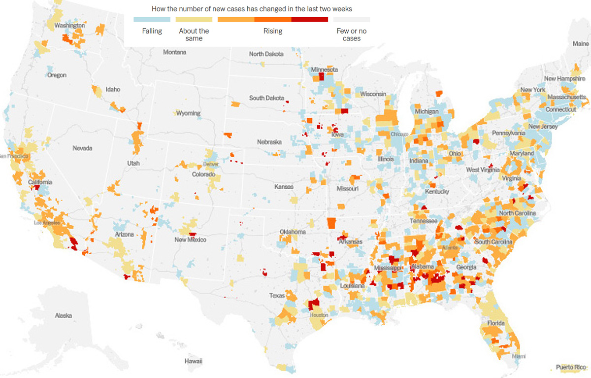
Figure 12. Map indicating relative growth in new cases in the two weeks leading up to June 2.94
Examination of Figure 12 shows that cases are decreasing in some major metropolitan areas and, in particular, the New York area. At the same time, there has been growth in the rest of the country until the first week in May.95. In fact, the number of daily cases (5 day smoothed average) has declined somewhat since May 5 (approximately 25,000 on May 5 to 19,000 on May 27 before rising again to 21,000 on June 2.
This prompted me to look at additional evidence that the infections are becoming more prevalent in less populated areas. In particular, I looked at the 10 most densely populated states (New Jersey, Rhode Island, Massachusetts, Connecticut, Maryland, Delaware, New York, Florida, Pennsylvania and Ohio in that order). These states have 25% of the US population and had 59% of all the cases in the US on May 1. This fell to 49% by June 8. On the other hand, the 10 states not in the above list with the highest number of cases per capita (Illinois, Louisiana, Nebraska,
Iowa, Michigan, South Dakota, Virginia, Mississippi, Indiana and Minnesota) with 17% of the US copulation had 18% of the US cases on May 1 and 21% on June 9.
Trends in Countries Covered
Table 8 summarizes major trends as of June 9, 2020. It is noit intended to present any new information but, rather, to provide a simple comparison between the various “countries”.
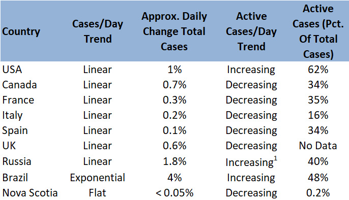
Table 8. Overview of trends as of June 9, 2020(24)note 1. Active cases have decreased on a few days in Russia but the general trend is increasing
Will Trump’s Electoral “Gamble” Pay Off?
While not explicitly stated, it seems that the President is trying to change the subject. With the mounting number of cases and deaths – approximately 28% of the world totals in both cases as of June 9 – it’s hard to make the argument that everything was done “perfectly”. While it’s undoubtedly true that some countries have understated their number of cases, it’s still a shameful record for the richest country in the world.
As of June 9, visibility for the Coronavirus case and death rate has certainly diminished and shifted toward three areas – two of which have been driven by Trump:
- As discussed above, the messaging has changed from how well the fight against the pandemic has gone to reopening the economy. Recently, there has been a focus on the May jobs report showing 2.5 million jobs added96 and the resultant rise in stock markets.
- Another subject change initiated by the President is the so called “Obamagate” scandal97 which has certainly gained a lot of attention in the right wing media
- The demonstrations following the death of George Floyd.
So far, this hasn’t worked very well for the President. According to the well regarded FiveThirtyEight website, on March 12 when the pandemic wasn’t much of an issue in the US (1598 cases and 41 deaths), approval of the President was at 43.2% of the President hit a peak of 53.1%. As with other world leaders, this was followed by an increase in the polls with approval peaking at 45.8% on April 4 ( 362,952 cases and 10,746 deaths). At this point, presumably because of disillusionment with the President’s approach approval fell fairly steadily to 41.1% on June 10 with disapproval at 54.9% – its highest level since January.
So, I will conclude with the question. Can Trump conjure a new issue to reverse this? At the moment he seems to be betting on a combination of the economy, law and order and claims that Democrats want to defund police forces.
Or, will Coronavirus start to increase again and attract attention along with, perhaps, stalling of the economy and markets?
References
- This is a sample reference.
- Crystal Watson of the Johns Hopkins Center for Health Security quoted in Coronavirus may take weeks to reemerge after U.S. starts reopenings: experts, Global New website, May 13, 2020
- Data taken from COVID-19 pandemic in Georgia Wikipedia Page using the Internet Archive Wayback Machine for historic data
- See 10 Real Life Examples Of Exponential Growth for example.
- See What’s the Big Deal With the Mathematical Constant “e”? for example)
- taken from tWorldometer website: China Coronavirus Page
- Italy’s novel coronavirus cases rise to 17 as cluster emerges, PBS website, Feb 21, 2020
- See, for example,Wikipedia COVID-19 pandemic in Russia page
- Coronavirus Statistiques en Espagne – Evolution du nombre de cas et de Contaminations jour par jour, Efficiens website
- The data for Figure 3 and elsewhere in this post (including Figures 4 through 12) are taken from the CORONAVIRUS STATISTIQUES and Worldometer COVID-19 Coronavirus websites and Wikipedia Covid Pages – e.g. COVID-19 pandemic in the United States
- Ce n’est pas un pic de contaminations, mais bien une réactualisation des données réparties du 13 au 28 mai. Numerama website, May 29, 2020
- Details and updates can be found at the Northwood Information Updates website
- See Nova Scotia Novel coronavirus (COVID-19) website for details
- Why COVID-19 testing varies so much across Canada, CBC webaite, April 4, 2020
- For a discussion of the Montreal situation as of March 30, see Why are so many people getting sick and dying in Montreal from Covid-19?, The Guardian, May 13, 2020
- Nine new COVID-19 cases reported as cluster in northern New Brunswick grows, The Globe and Mail, June 8, 2020
- Data taken from from Wikipedia COVID-19 pandemic in Canada page
- Brazil’s Pandemic Is Just Beginning, The Atlantic, May 10, 2020
- See, for example, St Petersburg death tally casts doubt on Russian coronavirus figures, The Guardian, June 4, 2020
- Half of People With COVID-19 Do Not Have Symptoms, Iceland Testing Shows. Physician’s Briefing website, April 1, 2020
- COVID-19 Outbreak Associated with Air Conditioning in Restaurant, Guangzhou, China, 2020, CDC Emerging Infectious Disease Newsletter, Volume 26, Number 7
- The Atlantic, April 16 2020
- See If Most Of Your Coronavirus Tests Come Back Positive, You’re Not Testing Enough, NPR website, March 30, 2020
- Data in Table 5 and other data below are taken from Wikipedia COVID-19 testing website and Our World in Data COVID Test Pages
- Daily test data here and in what follows taken from Our World in Data:Coronavirus (COVID-19) Testing
- Why is Russia reporting so few COVID-19 cases? Some say it’s a cover-up, ABC News, March 21 2020
- To understand the global pandemic, we need global testing, Our Word in Data website, March 31, 2020
- Coronavirus cases have dropped sharply in South Korea. What’s the secret to its success?, Science Magazine, March 17, 2020
- Italy sees virus cases quadruple in day as cluster emerges, CP24 website, Feb 21, 2020
- See Italy’s Virus Shutdown Came Too Late. What Happens Now?, New York Times, April 5, 2020
- Un funeral en Vitoria causó más de 60 infectados, El Pais, March 7, 2020
- Thousands march in Spain on women’s day despite coronavirus fears, Reuters website, March 8 2020
- Spain’s daily coronavirus deaths decline as testing increases, The Guardian, April 15, 2020
- Spain: Coronavirus Pandemic
- See Special Report: Five days of worship that set a virus time bomb in France, Reuters website March 30 2020 and ENQUETE FRANCEINFO. “La majorité des personnes étaient contaminées”, Le Monde, March 30, 2020 for details
- Emmanuel Macron annonce l’interdiction des déplacements non essentiels dès mardi midi, Marianne website, March 16, 2020
- COVID-19 Pandemic in Canada, Wikipedia. Case numbers for individual provinces can be seen by clicking on the province name in the table
- Canada Shows How Easy Virus Testing Can Be, Foreign Policy News, March 13, 2020
- 30 Days to slow the spread, The President’s Coronavirus Guidelines for America, March 15, 2020
- COVID-19 pandemic in the United States Wikipedia Page
- 7 governors still haven’t issued stay-at-home orders. Here’s why. CNN website, April 13, 2020
- See, for example, The U.K.’s Coronavirus ‘Herd Immunity’ Debacle, The Atlantic, March 18, 2020
- Britain Placed Under a Virtual Lockdown by Boris Johnson, New York Times, March 23, 2020
- Absolutely wrong’: how UK’s coronavirus test strategy unravelled, The Guardian, April 1, 2020
- Coronavirus: Matt Hancock sets aim of 100,000 tests a day by end of April, BBC News website, April 2, 2020
- Government target of 200,000 Covid-19 tests ‘meaningless’, The Guardian, May 28, 2020
- Russia Moves Toward Nationwide Lockdown as Virus Spreads, Bloomberg News website, May 29, 2020
- COVID-19 pandemic in Russia, Wikipedia
- See, for example Putin extends Russia’s lockdown for two weeks, prepares to ease in mid-May, Reuters website, April 28, 2020
- WHO notes good COVID-19 testing in Russia — official, TASS website, May 16, 2020
- See, for example, Municipal, State-Level authorities declare a state of emergency, The Brazilian Report website, March 17, 2020
- Brazilian cities move toward lockdowns as COVID-19 crisis intensifies, CBC website, May 12, 2020
- See for example, Bolsonaro says he ‘wouldn’t feel anything’ if infected with Covid-19 and attacks state lockdowns, The Guardian, March 25, 2020
- As Brazil’s COVID-19 testing lags, available labs go unused, Reuters website, April 15, 2020
- See COVID-19 Cases per Million Inhabitants: A Comparison Statistica.com, April 8 2020
- Based on data taken from worldometers.info – a good source on the situation in just about every country in the world
- The missing six weeks: how Trump failed the biggest test of his life, The Guardian, March 28, 2020
- Lockdown Delays Cost at Least 36,000 Lives, Data Show, The New York Times, May 20, 2020
- See About 95% of Americans have been ordered to stay at home. Business Insider website, April 7 2020
- See Here’s a look at what states are exempting religious gatherings from stay at home orders, CNN website, April 2, 2020
- The cluster effect: how social gatherings were rocket fuel for coronavirus,The Guardian, April 9. 2020
- Pentecostal church in Sacramento linked to dozens of coronavirus cases, La Times, April 2, 2020
- Kansas clusters tied to church gatherings, KCTV News, April 8 2020
- Opening up America Again, White House website
- White House Plan For Reopening States Leaves Testing Question Unanswered, NPR website, April 17, 2020
- Why Georgia Isn’t Ready to Reopen, in Charts, New York Times, April 24, 2020
- See, for example, Opinion: Georgia’s coronavirus data made reopening look safe. The numbers were a lie, The LA Times, May 18, 2018
- The Horror of the Coronavirus Data Lag, The Atlantic, May 15,2020
- Assessing States’ Readiness to Reopen, Raymond James, April 24, 2020
- See, for example, Operation reopen America: are we about to witness a second historic failure of leadership from Trump?, The Guardian, April 18, 2020
- Common Dream website, April 17, 2020. This is admittedly a “progressive” source but it’s facts are consistent with other sources
- Several Atlanta Class of 2020 prep school graduates test positive for coronavirus, CNN website, May 25, 2020
- See, for example. Americans defy Covid-19 social distancing rules to celebrate Memorial Day holiday, The Guardian, May 25, 2020
- Lake of the Ozarks Memorial Day partygoer tests positive for COVID-19, ABC website, May 30, 2020
- Coronavirus: more than a dozen US states see record high of new cases, The Guardian, June 9, 2009
- CDC Coronavirus Testing Decision Likely To Haunt Nation For Months To Come, Kaiser Health News website, March 23, 2020
- C.D.C. Labs Were Contaminated, Delaying Coronavirus Testing, Officials Say, New York Times, April 23, 2020
- Why has coronavirus testing in the US been such a disaster? The Guardian, March 13, 2020
- See this fact-checking of the claims: Coronavirus: President Trump’s testing claims fact-checked, BBC website, May 15, 2020
- Data taken from the Wayback Machine Internet Archive for the Wikipedia COVID Testing Page
- Trump: Coronavirus testing may be ‘overrated’ and reason for high U.S. case count, Politoco website, May 14, 2020
- Trump Claims 29 States may open in next few Days, Newsweek, April 16 2020
- CDC Director: ‘Very Aggressive’ Contact Tracing Needed For U.S. To Return To Normal NPR interview, April 10, 2020
- Coronavirus: ‘Liberate’ states protesting against lockdown, says Trump BBC News website, April 18, 2020
- See, for example, Democratic Governors Hesitating to Reopen States for Political Reasons, Trump Claims, Voice of America website, May 26, 2020
- Coronavirus: Trump says virus task force to focus on reopening economy, BBC website, May 7, 2020
- Trump’s Attempt To Spin the Coronavirus Crisis Isn’t Working, Vanity Fair, May 12, 2020
- 34 days of pandemic: Inside Trump’s desperate attempts to reopen America, Washington Post, May 3, 2020
- Donald Trump Press Conference Transcript on Jobs Report. Transcript posted on rev.com website, June 5, 2020
- See, for example, The Facts on Trump’s Travel Restrictions, factcheck.org website March 6, 2020
- The Social-Distancing Culture War Has Begun, The Atlantic, March 30, 2020
- Wearing a mask is for smug liberals. Refusing to is for reckless Republicans. Politico website, May 1, 2020
- Americans Social Distancing Decreases as Coronavirus Pandemic Persists, Poll Finds, US News and World Report, May 11, 2020
- Taken from Coronavirus in the U.S.: Latest Map and Case Count, The New York Times, June 2, 2020
- U.S. infection rate rising outside New York as states open up, CTV News website, May 5, 2020
- May Surprise: U.S. Adds 2.5 Million Jobs As Unemployment Dips To 13.3%, NPR website, June 5, 2020
- Changing Subject Amid a Pandemic, Trump Turns to an Old Ploy: Blame Obama, The New York Times, May 14, 2020
Pingback: Coronavirus Statistics – a Snapshot – Doug and Marilyn Pincock